")
")
")
News
- Ixchel Pérez
The future is here: RedCLARA renews its visual identity beginning a new cycle
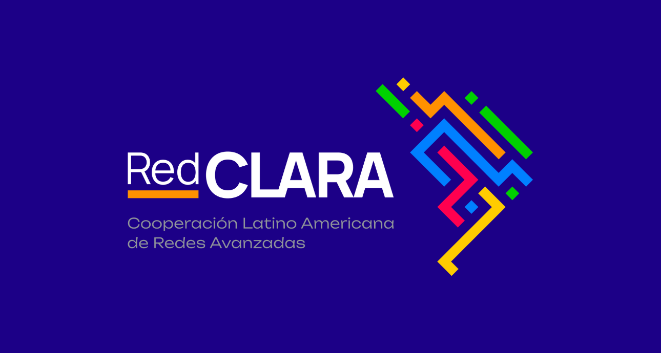
RedCLARA has a new face. The Latin American Cooperation of Advanced Networks launched on Monday 12 June its new visual identity as part of its 20th anniversary celebrations and at the beginning of a series of launches that will take place during the second half of 2023, opening the doors to a new cycle in the history of the network, increasingly broad, modern and human.
The RedCLARA brand includes a new visual system with new colors and institutional typographies. The brand has three pillars: movement, representing the information exchange among universities and research centers around the world; the connection among all the different Latin America and the Caribbean territories and communities; and diversity, capturing the plurality of the people living where the network operates through a rich palette of colors.
"Changing the logo and repositioning our brand is of high value, expressing our strong commitment to Latin America and the Caribbean. How the new logo is embodied, with the representation of the map, the interconnection of the lines and the beautiful colors, clearly show the identity of our region and the work we want to develop", explains RedCLARA's Executive Director, Luis Eliécer Cadenas.
Cadenas emphasizes that RedCLARA's 20th anniversary becomes the perfect occasion to unbox the new brand development. "It is a way to show the progress we have made in all this time and what we want to achieve in the coming years," he said.
The visual language adopted to shape the concepts of the new brand is inspired by the visual identities of global organizations, which commonly prioritize legibility and comprehensibility in their graphic solutions, considering the different audience profiles and cultures.
Furthermore, there is a significant change in the brand narrative. RedCLARA's storyline will now prioritize the social benefits related to the organization's activities, with a focus on improving the quality of life of people and communities. The structural and technological challenges of the region and the world are now seen as means to an end: to positively transform the world.
RedCLARA's branding over the years
This is the second meaningful rebranding of the regional network in its 20-year history. The first version of the RedCLARA brand was born shortly after the network's creation in 2003 when the globe and line icon framing the Latin American region was introduced and it received a refresh in 2011. In 2018, the brand kept the traditional icon but gained new typography and colors: from black, grey, and red, it became dominated by blue, orange, and white.
With the growth of its e-infrastructure, 11 National Research and Education Networks (NRENs) and more than 2000 universities and research centers connected, multiple partnerships signed, and important projects, such as BELLA and BELLA II, as well as the EU-LAC Digital Alliance recently subscribed and the expansion to the Caribbean, the time has come to broaden the horizon of the brand's comprehension and application.
RedCLARA's Executive Director said the change does not mean breaking with history, but represents the natural evolution of a network that seeks to constantly update itself for the good of Latin America, the Caribbean, and the world. "We have deepened partnerships, broadened the scope of our work, and evolved in terms of technology, connectivity, and personnel. The new brand comes to represent this evolution in a world that, especially after the pandemic, is evolving at a relentless pace".
To view, and download the new RedCLARA visual identity and brand manual, please https://bit.ly/3p06jcu
